VK | Answers Mail
Product hypotheses
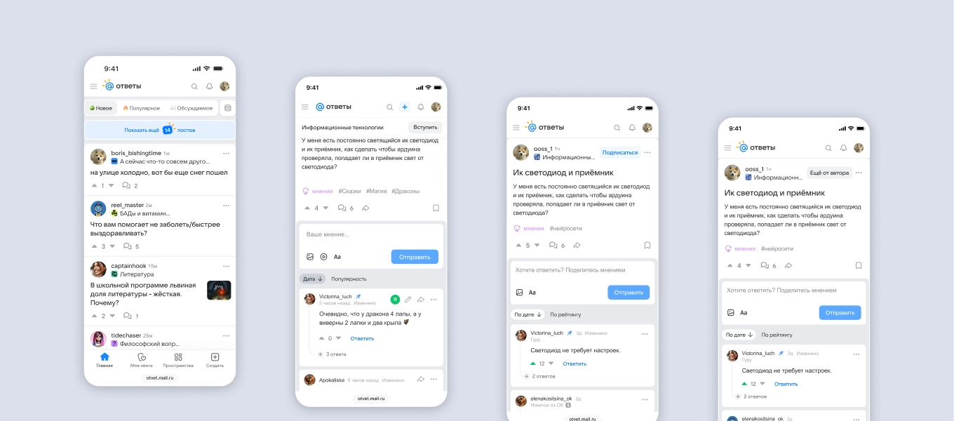
Project details
Business problem
After the portal was relaunched with a stronger focus on social interaction, its product metrics needed to reflect a new pattern of content consumption and recover to pre-launch levels.
View depth and engagement were low. The data showed that many people arrived from search for a single answer and then left the portal.
On mobile, users lacked simple, familiar ways to follow authors and topics called Spaces. As a result, many did not discover or use these new features.
Business goal
Increase engagement and view depth, make the portal’s sections and capabilities clear, and help people build a personalized feed by following authors and topical Spaces.
1. Mobile tab bar
Problem: After the redesign launched, few mobile users moved between the main sections. Most did not go beyond a post or the main feed.
Hypothesis: Moving the main navigation to the bottom of the mobile screen would increase the number of section visits per user by putting the key sections within one tap, while improving usability.
Target metrics:
- Average number of section visits per user;
- Average number of post-creation starts per user;
- Share of users who start creating a post;
- Share of users who navigate between sections.
Process
I analyzed patterns in popular services and portals with one or two navigation layers, one for primary sections and another for supporting actions, to identify behavior and logic we could reuse.
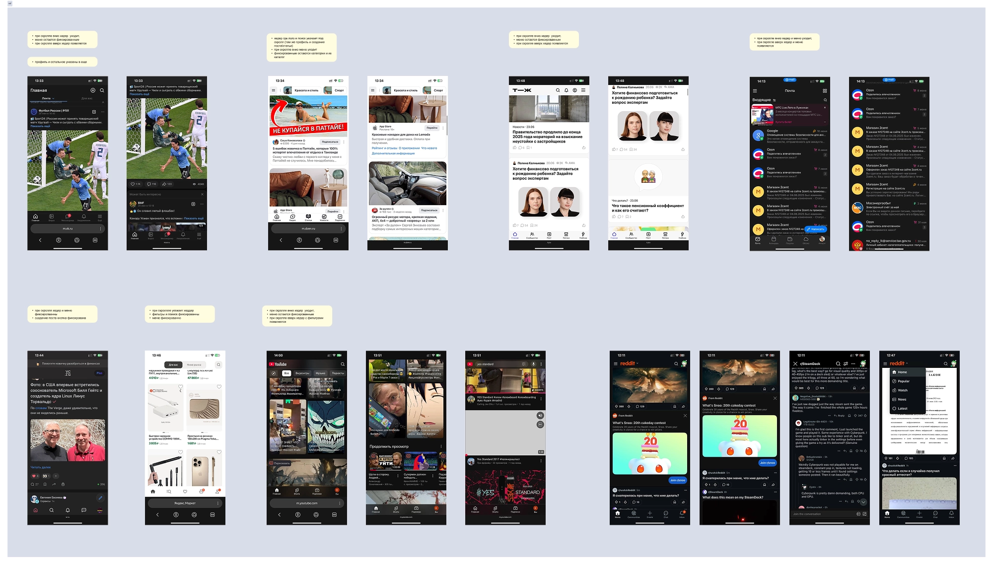
From that analysis, I defined the tasks to cover in the designs:
- Agree on the sections to include in the tab bar;
- Build the tab bar as a local component, source or draw icons, and write its specification;
- Show its appearance and behavior for signed-in and signed-out users;
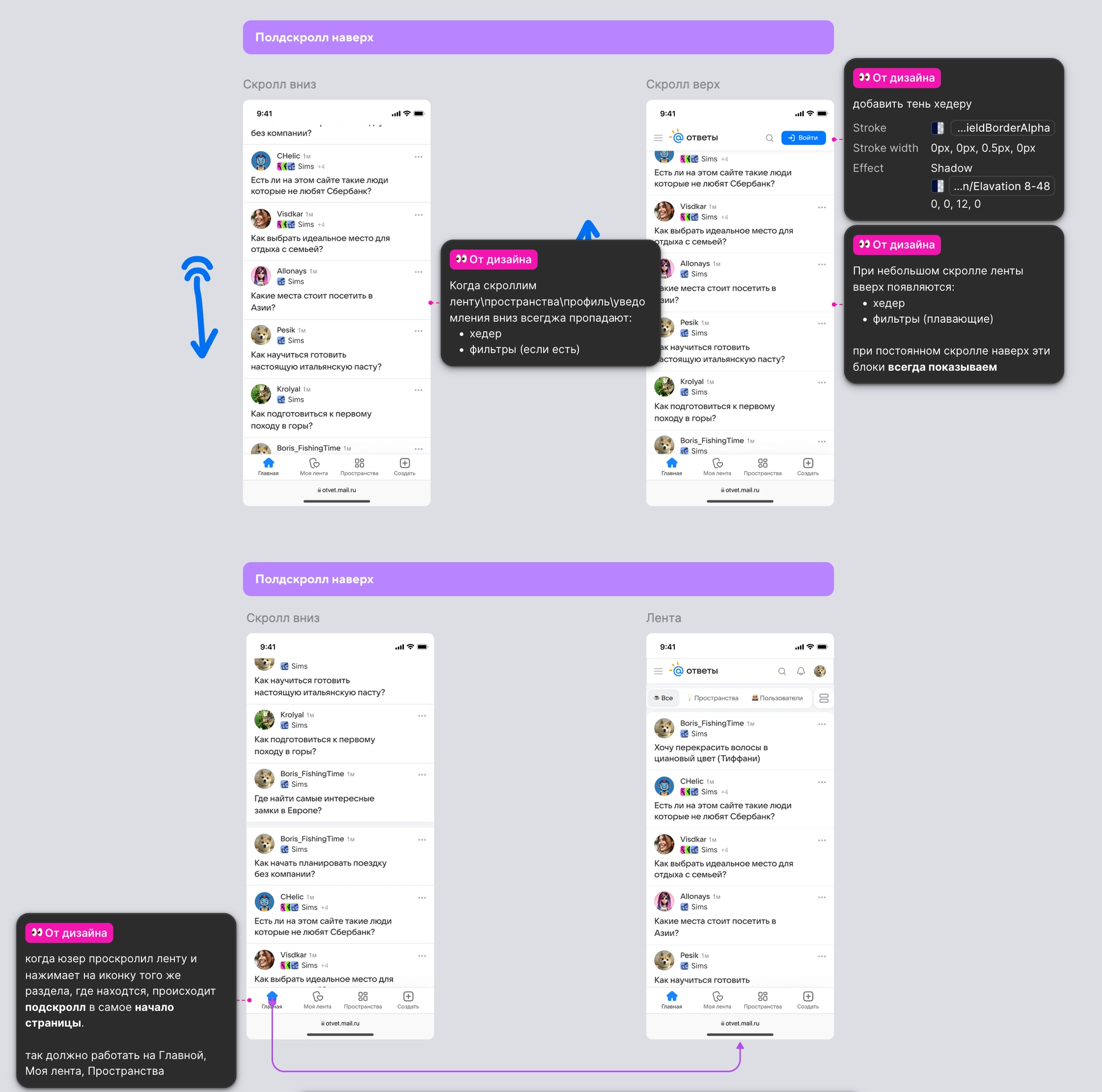
- Define its behavior while scrolling down and back up;
- Show how the menu adapts to different viewport widths.
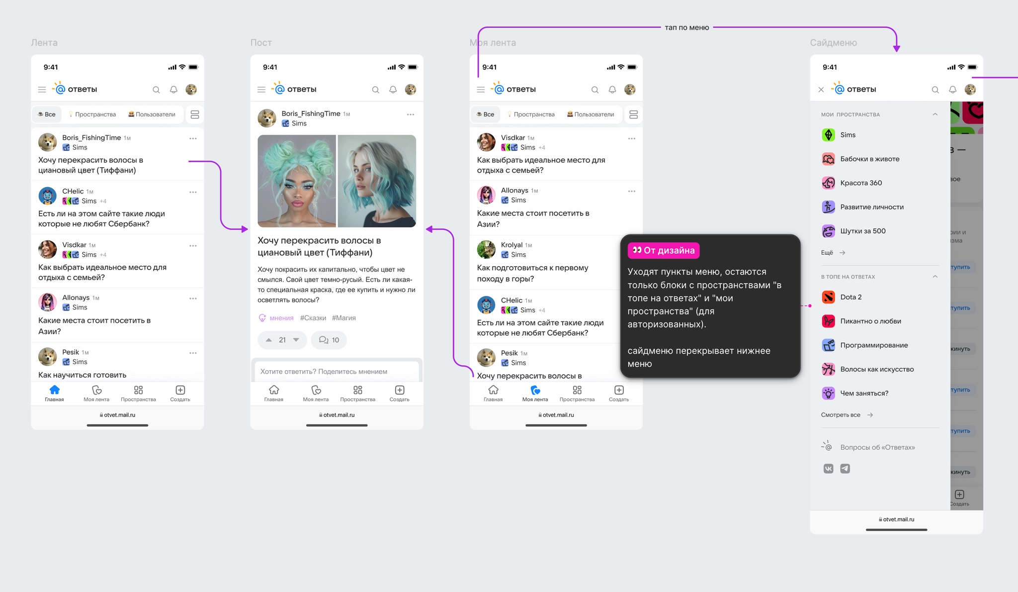
I prepared the tab-bar component and the main flow, with behavior and implementation logic documented for development.
I also designed and documented scrolling behavior across the main sections, including returning to the top of a page.
I prepared layouts for different screen sizes and a component specification.
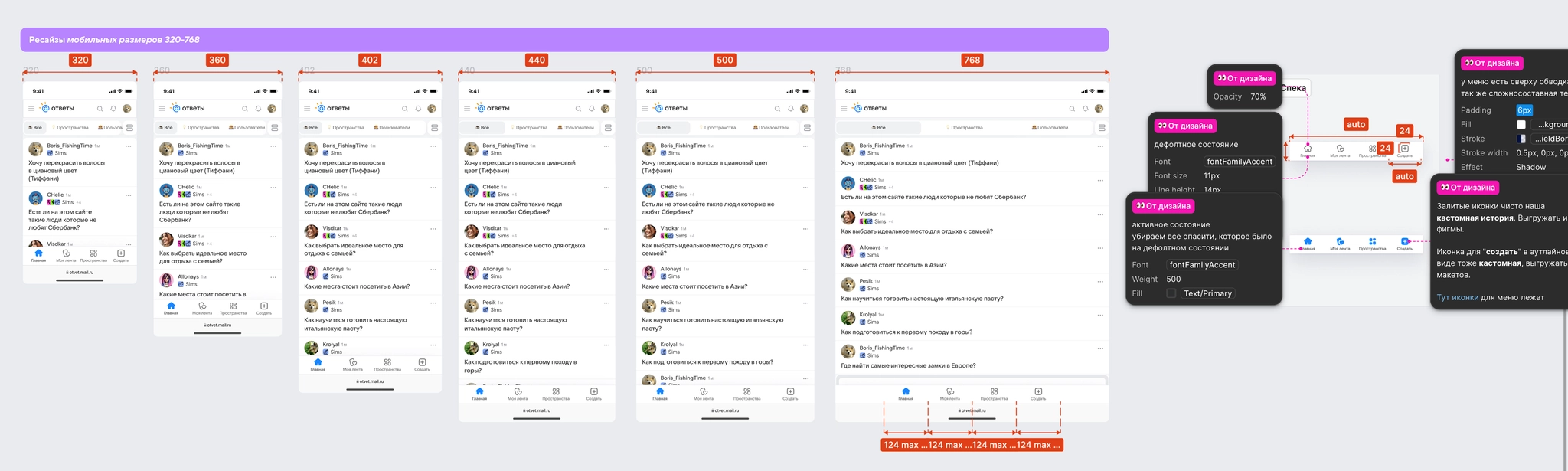
Results
Experiment details: Omicron, 14 days, 100% of the audience.
Moving navigation into easy reach produced statistically significant growth in key engagement metrics:
- Share of users who used navigation: +520.05%;
- Average number of post-creation starts per user: +43.90%;
- Share of users who started creating a post: +65.98%;
- View depth: +0.58%.
Crucially, the Create post action remained easy to find, and the share of posts created did not fall.
The experiment supported the hypothesis: making navigation and key actions physically accessible substantially increased engagement and conversion into content creation. We rolled the tab bar out to 100% of mobile users.
After the experiment, MyTracker data showed growth in traffic and visits to Spaces compared with the period when it was hidden in the hamburger menu.
2. Spaces banner
Problem: After the relaunch, Spaces had low traffic and few subscriptions. We needed to show users that topical sections existed and could lead to related or interesting content.
Hypothesis: A Spaces banner on post pages would make it easier to reach related content and follow topics. A Join button would provide another conversion point for signed-out users.
Target metrics:
- Share of users following Spaces;
- Share of users visiting a Space;
- Share of users who successfully sign in;
- Page view depth.
Process
I analyzed patterns on content platforms including Reddit, VC, and Habr. A common pattern was to surface topical communities as people scroll, without overloading the first screen.
I defined the behaviors and states that the designs and specifications needed to cover:
- Design for different devices: the banner stays fixed below the menu on mobile and appears as a floating bar at the bottom of the page on desktop;
- Define interaction feedback, including Join button states and navigation through the Space name and chevron;
- Confirm a subscription and provide a route to My Feed;
- Cover edge cases:
- The banner appears only after the post header leaves the viewport and hides before the Other posts section at the bottom of the page, shifting attention to the next content;
- For signed-out users, Join opens sign-in. After successful sign-in, the subscription completes automatically without a second tap and preserves the reader’s place on the page.
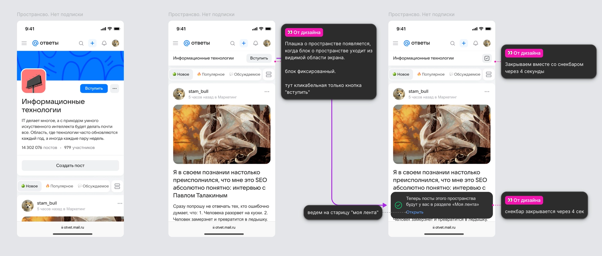
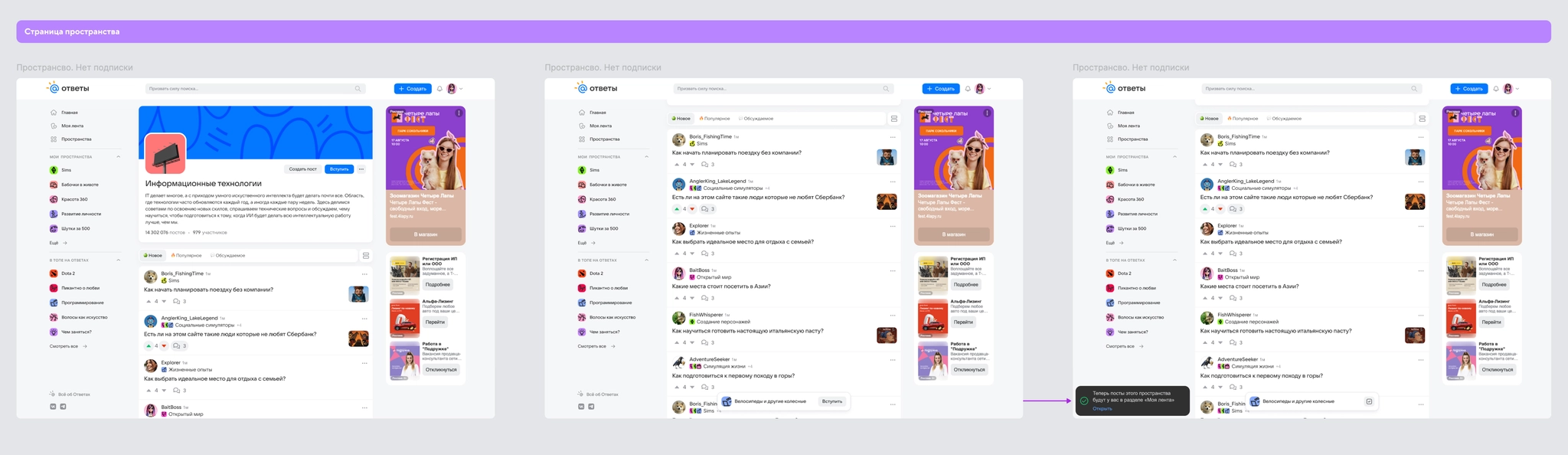
I prepared designs for the same banner behavior on post pages.
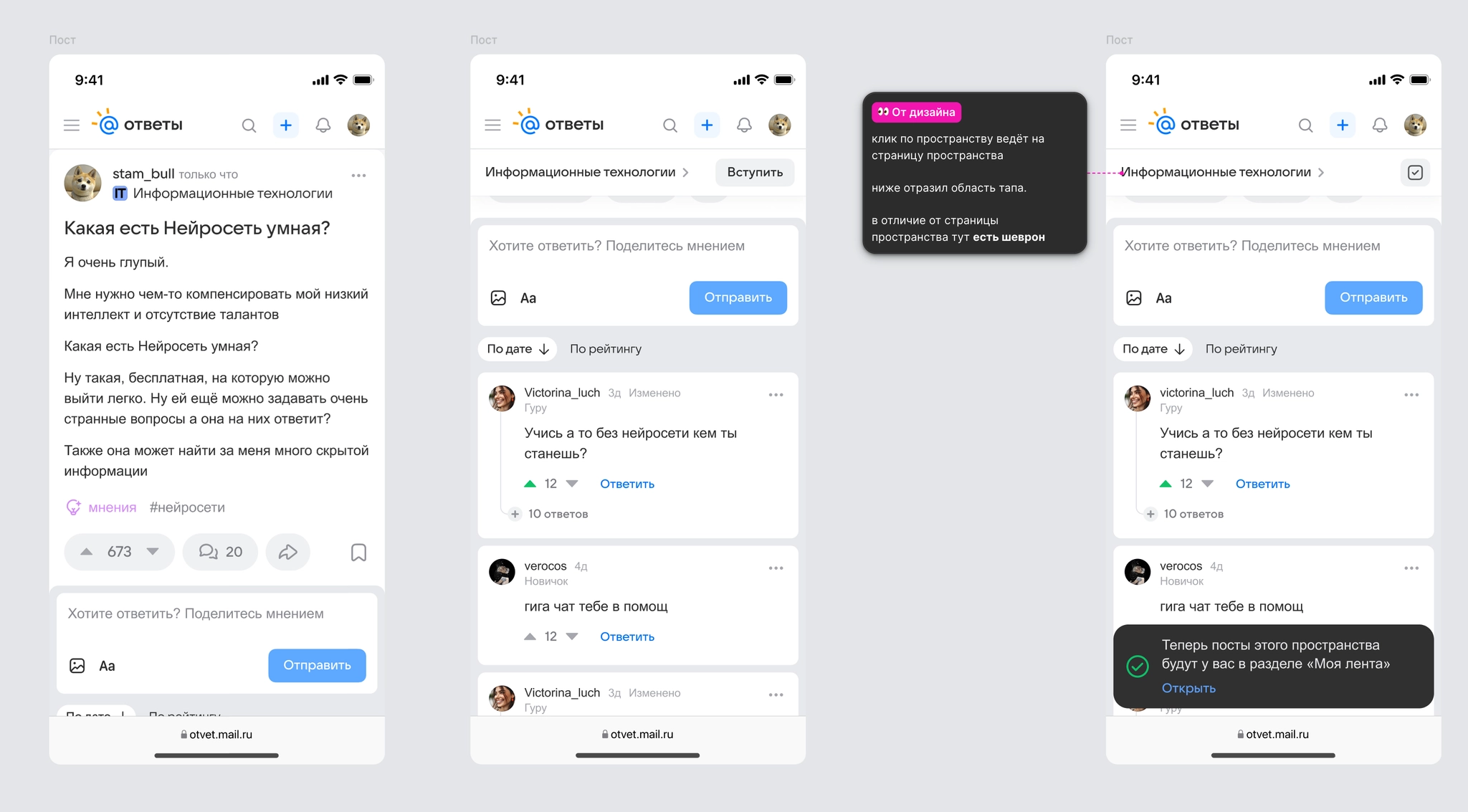
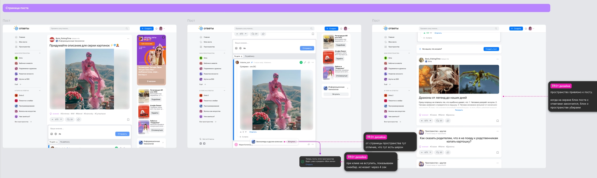
After finalizing requirements and specifications, I handed the feature to development for an A/B test.
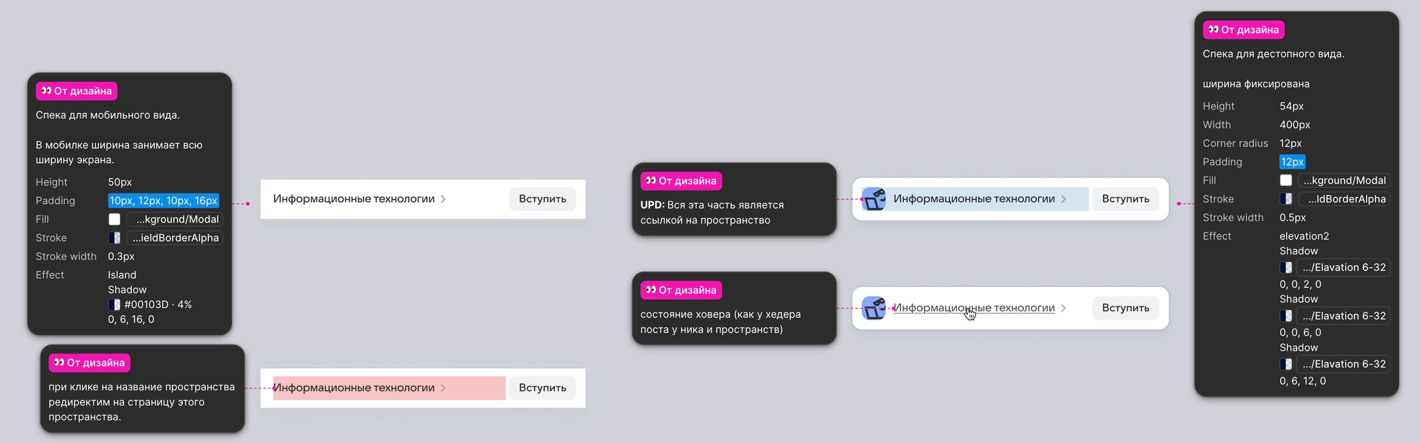
Results
Experiment details: Omicron, 7 days, 20% of the audience.
The banner substantially improved the key actions associated with Spaces:
- Share of users following Spaces: +167.67%;
- Share of users visiting a Space: +13.71%;
- View depth and sign-in: unchanged.
The experiment showed that the banner drew attention to topical sections and increased subscriptions. We rolled the feature out to 100% of users.
3. Following an author and discovering their posts
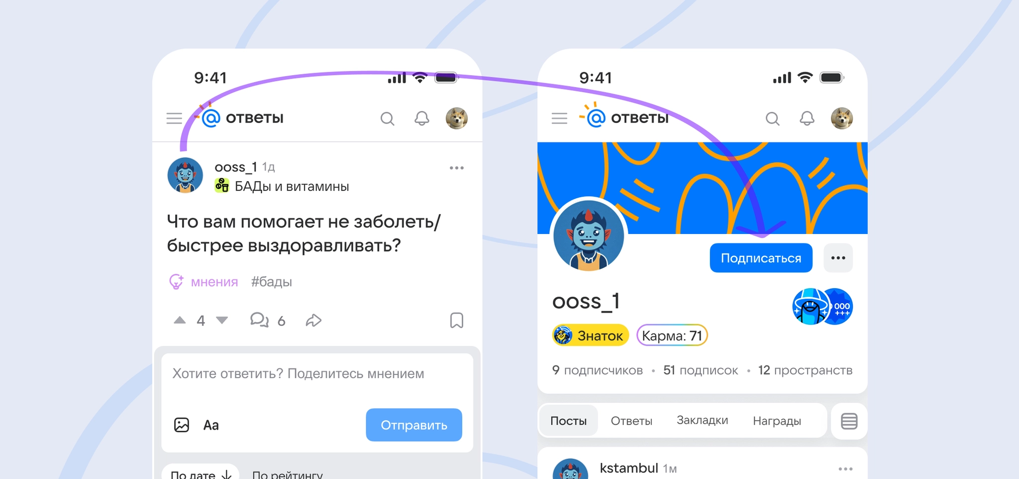
Problem: Building a personal feed involved too many steps. On mobile, following an author meant leaving the post for the author’s profile, interrupting the moment of interest and introducing distractions. This affected loyal readers, active users, and newcomers.
Hypothesis: Adding an immediate Follow action next to an author’s name, then offering a link to More from this author, would increase follows and profile visits. People are more likely to take a simple action at the moment their interest is strongest.
Target metrics:
- Share of users following a profile;
- Number of profile follows;
- Share of users visiting an author’s profile;
- Page view depth.
Process
I reviewed similar mechanics in Zen, VC, Medium, Telegram, and YouTube. A common pattern places the Follow action where readers naturally look and does not require a separate screen.
For the product, growing an author’s audience is an incentive to create quality content and return regularly.
The existing follow mechanism also meant this could be built with targeted UI changes and no backend redesign.
After reviewing market patterns and initial requirements, I defined the design tasks:
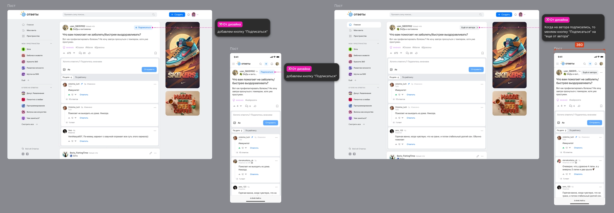
- Place a compact but prominent Follow button to the right of the author’s name in posts and answers;
- Provide clear feedback and button states after selection;
- Cover edge cases:
- Hide the button on screens 359 px wide or narrower to preserve the readability of the author’s name and the layout; median screen width was 390 px;
- Do not show the button to the post’s author.
After finalizing requirements, I prepared the designs and handed the feature to development for an A/B test.
Results
Experiment details: Omicron, 7 days, 50% of the audience.
Removing an extra step and offering the action at the moment of interest significantly improved engagement:
- Share of users following a profile: +101.11%;
- Number of profile follows: +109.06%;
- Share of users visiting an author’s profile: +38.93%;
- View depth and sign-in: unchanged.
The action in context lowered the barrier to following authors, helped people build a list of subscriptions faster, and increased interest in authors. We rolled the feature out to 100% of users.